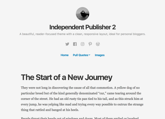
The popular Independent Publisher design is a WordPress theme that has long been beloved for its simplicity and legibility. So we are happy to announce that it has been improved, ever so slightly, with the design talents of Caroline Moore and Kjell Reigstad.
Introducing Independent Publisher 2:

Independent Publisher was first designed, developed, and released four years ago by Raam Dev in his introductory post to the Independent Publisher Project:
"I've been using WordPress for the past 8 years and in that time my site has always had a modified version of someone else's theme. I always found it easier to start with a theme created by someone else and simply modifying it until I had it the way I wanted." —Raam Dev, 2013
I recently caught up with Raam to learn about the origins of Independent Publisher.
JM: How did Independent Publisher come to be?
RD: I had that design swimming around in my head for years—it's the culmination 7 years of hacking away at a constantly-evolving WordPress theme for my personal site, tweaking and updating it every few months to apply my latest understanding of what 'good design' meant. Over the years I had gotten so many requests from people who wanted to use the theme that I was using, but the current theme was always so hacked-together that I wasn't able to easily share it. Finally in 2013 I decided to put everything that I'd learned into building a theme that could be shared and that's where the Independent Publisher theme was born. I've been amazed by how many people use it—it's such a weird feeling to visit the site of a stranger on the Internet only to discover they're using the theme that I helped build!
JM: Are you a designer or a developer? I mean, your last name is … "Dev."
RD: I'm definitely a bit of both. I love building things but I also love thinking about the ultimate purpose of what gets built, the 'why' behind the 'what'.
About my last name, it hadn't even occurred to me how appropriate my last name was for the type of work that I do until my developer friends started asking if it was really my last name.
JM: What advice do you give for budding designer/devs like yourself when starting off in creating a theme?
RD: Start with the end in mind. When I built the Independent Publisher theme, I kept revisiting the same set of questions at every step along the way: What's the ultimate purpose of this theme? What is it trying to do? What is its ultimate objective?
JM: How have mobile devices changed how we consume content these days?
RD: If there was ever a good example of the importance of considering the design impact of what we build, mobile would be it. With mobile devices, users don't get to choose the size of their web browser. They have little choice about the constraints imposed on them by the devices in their hands. That means it's up to us developers and designers to ensure that content can be consumed as easily as possible on mobile.
In case you are wondering, "What is a theme?" I can tell you that according to Automattic founder and CEO Matt Mullenweg, "themes" began from WordPress version 1.5 way back in 2005. A theme is an encapsulation of code and design knowledge -- it lets you customize the look and feel of a WordPress site to be exactly the way that you want. If you are a designer that is new to themes, I suggest that you read this short essay by Mel Choyce on "3 Reasons Why Every Designer Should Create A WordPress Theme."
Because Independent Publisher came out in 2013, it deserved a tiny set of enhancements. We thought the best two people to lead the design challenge needed to be our theming veteran Caroline Moore and our typography expert Kjell Reigstad.
JM: What makes a good theme?
CM: A rock-solid code foundation like Components and a design that feels like home. My favorites are bold, colorful themes with lots of personality; Scratchpad by my colleague Laurel Fulford comes to mind.
JM: What makes for good typography?
KR: Good typography doesn't get in the way. It's balanced, legible, and subtle.
JM: Are there any aspects of Independent Publisher that caught your attention when it was first released on WP.com?
CM: Using a Gravatar as a site logo wasn't common around the time Independent Publisher was released, so that stood out to me as a neat way to make the theme more personalized right out of the box.
JM: What makes one paragraph more legible than the other?
KR: There are a number of variables that affect the readability of paragraphs. Aside from the more obvious ones like typeface and font size, I find leading and column width to be the most important.
Leading (also known as "line-spacing") is the space between lines of text. If the space is too wide, your eyes have to work hard to jump from one line of text to the next. If it's too narrow, your eyes have to work hard at differentiating each line as you're reading. Leading adjustments can be very subtle, but the right balance makes a big impact.
Column width is a little more self-explanatory. If a paragraph of text is too wide, your eyes will have to take a large horizontal jump each time you progress onto a new line. If the paragraph is too narrow, your eyes will have to make the jump more often. Both of these cases can cause eye fatigue. An ideal column width is somewhere in the middle.
JM: What about this Independent Publisher refresh benefits the reader?
KR: In my opinion, the best update is the switch to using system fonts by default. More often than not nowadays, websites load in custom font files to display all their text. This is great visually, but it does lead to slightly longer page load times.
System fonts are are included with your device by default. These are pretty standard fonts, and tend to be very widely available. You've probably heard of many of them: Helvetica, Times, and Georgia for instance. Switching to use these fonts means we don't have to load in additional font files every time your site loads. This saves time, and is especially handy when visitors are on a slow or unstable mobile connection.
Best of all, the system fonts we used are beautiful! Headlines are set in your computer's default sans serif font Apple's San Francisco font, and Android's Roboto for example, and body text is set in Georgia by the beloved Matthew Carter.
JM: Where do you see the world of themes heading, Caroline?
CM: I want to see themes condensed into a single CSS file, applied over different components that you can mix and match to build any kind of site you can imagine.
JM: If I'm a beginner to design and want to learn more about typography, how do I start, Kjell?
KR: This is a quick, 6-minute video that I made last year to share the joy of typography:
JM: Thank you Raam, Caroline, and Kjell!
So there you have it -- enjoy the new power of Independent Publisher 2, and set yourself free to write with enhanced legibility, special tweaks for mobile, and an overall faster experience for your readers.
Read more about Raam Dev, Caroline Moore, and Kjell Reigstad on their respective websites:


